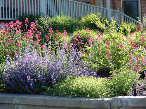
If you're a gardener, you know that bees are essential for pollination. Without bees, many plants wouldn't be able to produce fruit or flowers. That's why it's …
Garden and plants
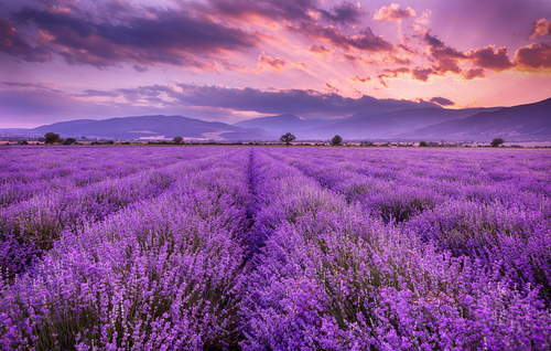
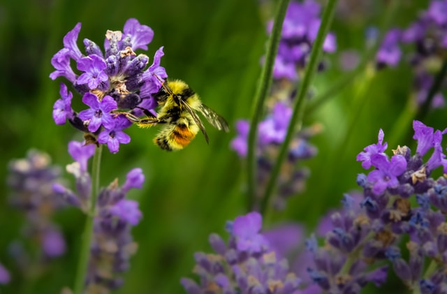
How to Grow Lavender: What is Lavender, Varieties, Propagating from Cuttings, Drought, Sun and More
Lavender (Lavandula) is a genus of about 30 species of flowering plants in the mint family, Lamiaceae. It is native to the Old World and includes both annual …
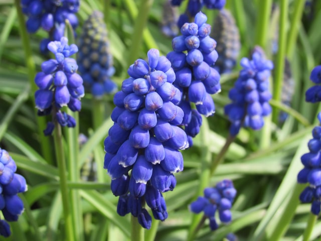
The Common Grape Hyacinth: An In-Depth Care Guide
The Common grape hyacinth is a beautiful flowering plant that can be found in many gardens across North America. It is easy to care for, but there are a few …
[Read more...] about The Common Grape Hyacinth: An In-Depth Care Guide
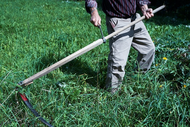
How to Mow with a Scythe
How to Mow with a Scythe Mowing is one primary secret in keeping the lawn healthy. Frequent and proper trimming encourages profound root growth. Additionally, …
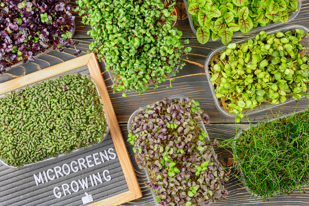
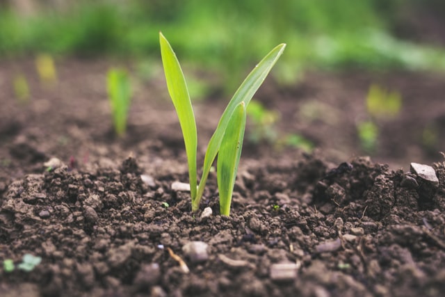
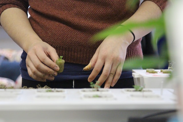
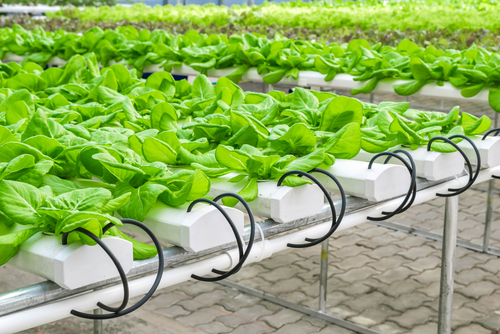
How to grow microgreens at home (+hydroponics)
How to grow microgreens at home? Are you looking for ways to increase your vegetables' flavor, and nutritional value? Do you want to increase the yield of your …
[Read more...] about How to grow microgreens at home (+hydroponics)
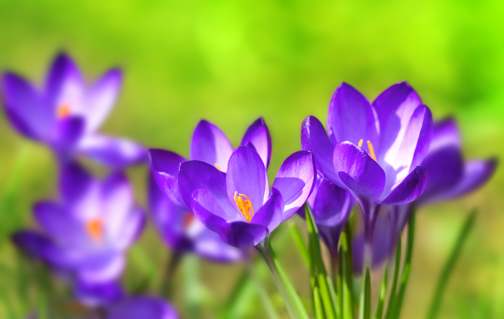
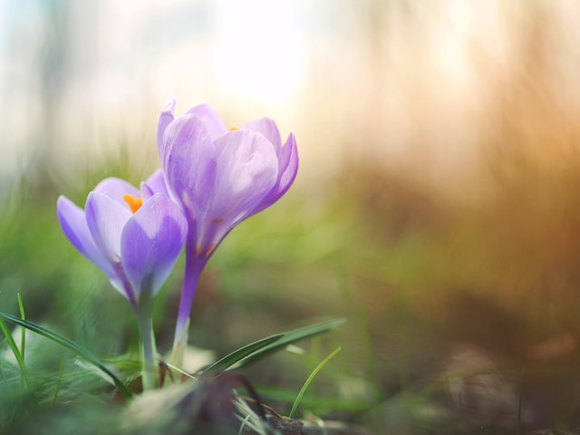
The Crocus: A Comprehensive Care Guide
The Crocus is a beautiful flower that has been around for centuries. There are many different types of Crocuses, and each one requires a different level of …
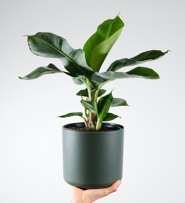
Banana tree plant: care guide
Banana trees are some of the more popular types of tropical plants that bring color to gardens worldwide if you're thinking about growing one in your yard or …
Outdoor hydroponics: tips, pros and cons + best set-up and plants
Outdoor Hydroponics: Tips, Pros and Cons and the Best Set-Up and Plants Over the last few years, most people have developed an interest in growing their …
[Read more...] about Outdoor hydroponics: tips, pros and cons + best set-up and plants
Hydroponics Vs. Soil: Gardening At Home
Hydroponics Vs. Soil Gardening At Home Hydroponics is an agricultural method that does not use soil at all. Plants are grown with their roots suspended in …
[Read more...] about Hydroponics Vs. Soil: Gardening At Home
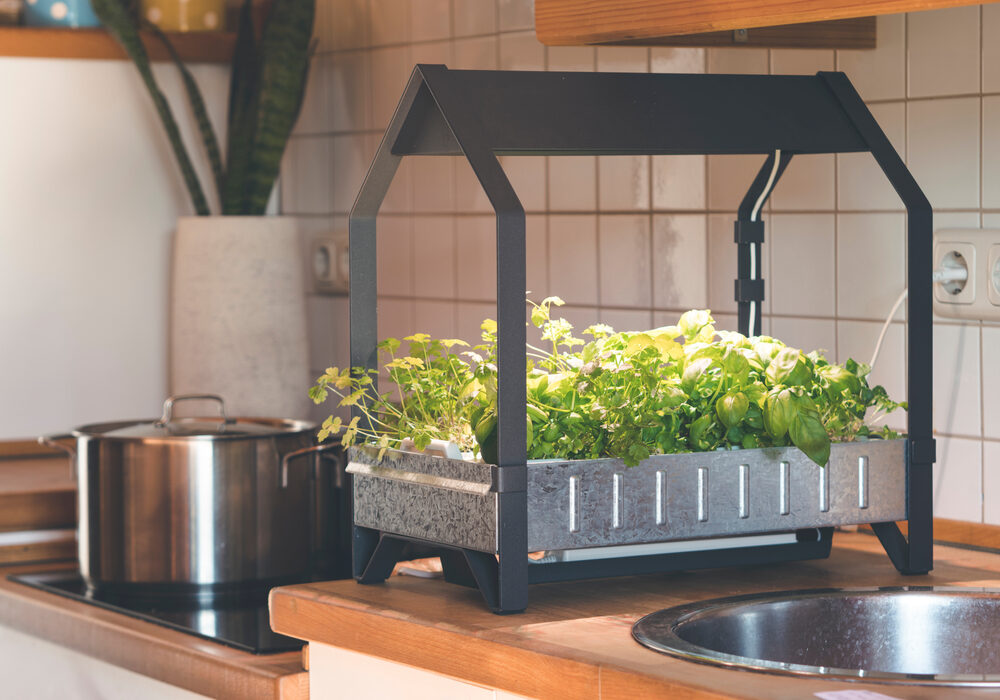
Setting Up An Indoor Hydroponic System For Home: DIY Hydroponics at home
Setting Up An Indoor Hydroponic System For Home What is an Indoor Hydroponic system? An indoor hydroponic system is a self-contained unit that utilizes the …
[Read more...] about Setting Up An Indoor Hydroponic System For Home: DIY Hydroponics at home

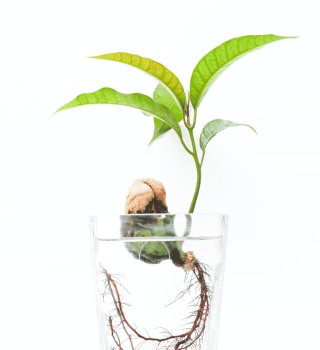
Hydroponics: what is the Kratky Method? Easy hydroponics for beginners!
Hydroponics is one of the most exciting ways of growing food. With hydroponic systems, the roots of plants have unrestricted access to oxygen, which leads to …
[Read more...] about Hydroponics: what is the Kratky Method? Easy hydroponics for beginners!
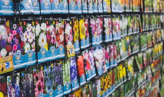
The best seeds for hydroponic gardening – do you need special seeds?
The best seeds for hydroponic gardening - do you need special seeds? The Best Seeds for Hydroponic Gardening Hydroponic Gardening is a type of farming but …
[Read more...] about The best seeds for hydroponic gardening – do you need special seeds?
What is urban farming?
What is urban farming? More often than not, when we hear the word farming, we assume they accomplish the crop growing off in the distance in some rural …
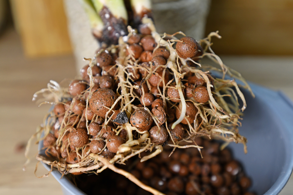
Hydroponics: growing medium (all you need to know)
Hydroponics Growing Medium What is a hydroponic growing medium? The hydroponic growing medium is an artificial soil that a grower uses to grow plants without …
[Read more...] about Hydroponics: growing medium (all you need to know)
Aquaponics vs Hydroponics: Differences, Similarities, Advantages and disadvantages
Aquaponics vs Hydroponics: Differences, Similarities, Advantages and disadvantages Growing plants in an enclosed system without the use of soil is called …
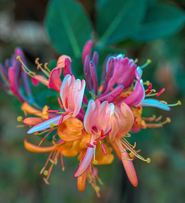
Honeysuckle Grow and Care : Everything You Need to Know
If you're looking for an easy-to-grow perennial that will provide beautiful blooms all summer long, honeysuckle is the plant for you! Honeysuckle is a hardy …
[Read more...] about Honeysuckle Grow and Care : Everything You Need to Know

How to Care for Your Areca Palm: The Ultimate Guide
Areca Palms are beautiful plants that can be grown indoors. They are easy to care for, but there are some things you need to know in order to keep your Areca …
[Read more...] about How to Care for Your Areca Palm: The Ultimate Guide
Macodes Petola: Care Guide
The Macodes Petola (Jewel Orchid) is a beautiful evergreen perennial that can be found in USDA Zones 8-10. These plants are often used as ground cover, and can …
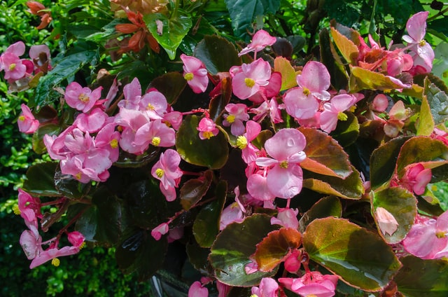
How to grow begonias: begonia care guide (pruning, growing, propagating…)
How to grow begonias: Begonia has many common names and you will find them all listed on plant tags: angel wing, wax begonias, cane-stemmed begonias, rex …
[Read more...] about How to grow begonias: begonia care guide (pruning, growing, propagating…)
Meaning of flowers: what do flowers mean?
Meaning of flowers Flowers have been used for centuries to express emotions and feelings. However, each type of flower has a different meaning, and it is …
[Read more...] about Meaning of flowers: what do flowers mean?
The Best Deer-proof bulbs
The Best Deer-proof bulbs Deer are a problem for many people, especially those who grow food. Deer will eat all the fruits and vegetables you have grown if …
Plants that repel flies (+ herbs and flowers)
The summer is coming and the flies are already out. Many of you know how much it bothers to swat at them, but did you know that there are plants that repel …
[Read more...] about Plants that repel flies (+ herbs and flowers)
25x The best summer bulbs
Summer is just around the corner, which means that it's time to start thinking about what you're going to plant in your garden. Bulbs are great for any kind of …
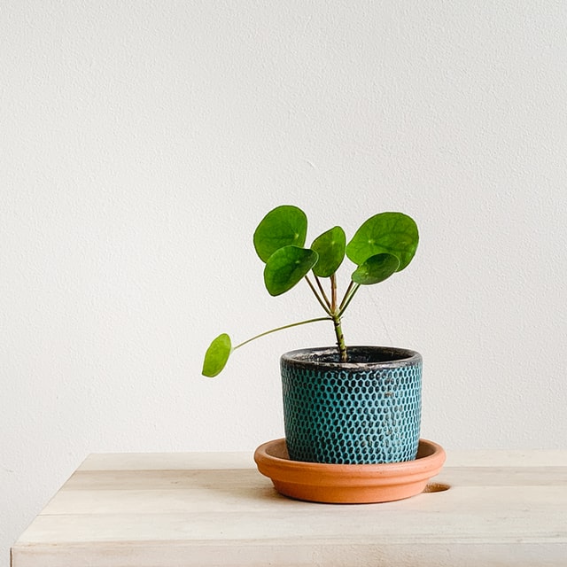
The Chinese Money Plant: A Comprehensive Care Guide (Pilea care)
The Chinese Money Plant, also known as the Pilea peperomioides, is a beautiful and easy-to-care-for plant that has become increasingly popular in recent years. …
[Read more...] about The Chinese Money Plant: A Comprehensive Care Guide (Pilea care)
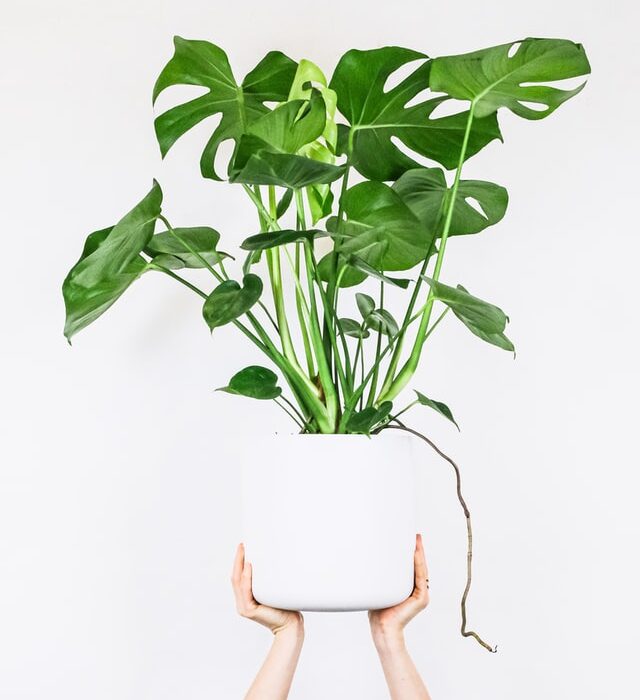
Monstera Plants (Swiss Cheese Plant) care guide: soil, water, diseases and more
Monstera plants (Swiss Cheese Plant) are beautiful and unique houseplants that can be a great addition to any home. They are easy to care for, but there are a …
[Read more...] about Monstera Plants (Swiss Cheese Plant) care guide: soil, water, diseases and more

Outdoor kitchen: which kitchen to choose, price, styles & ideas
Outdoor kitchens are the way of the future. They provide warmth, comfort, good food, and an outdoor environment that can be enjoyed by both adults and kids …
[Read more...] about Outdoor kitchen: which kitchen to choose, price, styles & ideas
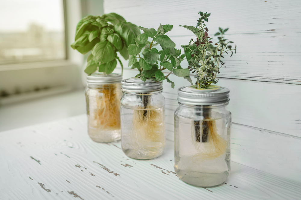
How to grow herbs in water (hydroponically)
How to grow herbs in water Growing Herbs in Water Gardening is an excellent hobby for relieving stress and stocking your spice cabinet with organically grown …
[Read more...] about How to grow herbs in water (hydroponically)
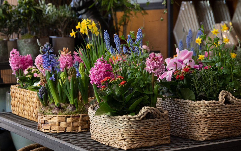
When to plant flower bulbs: a guide per month (spring and summer flower bulbs)
When to plant flower bulbs: a guide per month. Spring is finally here. And with it comes the joy of planting bulbs for your flowerbeds. If you've ever tried to …
[Read more...] about When to plant flower bulbs: a guide per month (spring and summer flower bulbs)
Hydroponics: which nutrients to choose for your home garden?
Hydroponics: which nutrients to choose for your home garden? Hydroponic Gardening In the highly competitive world of food production, few people have time or …
[Read more...] about Hydroponics: which nutrients to choose for your home garden?
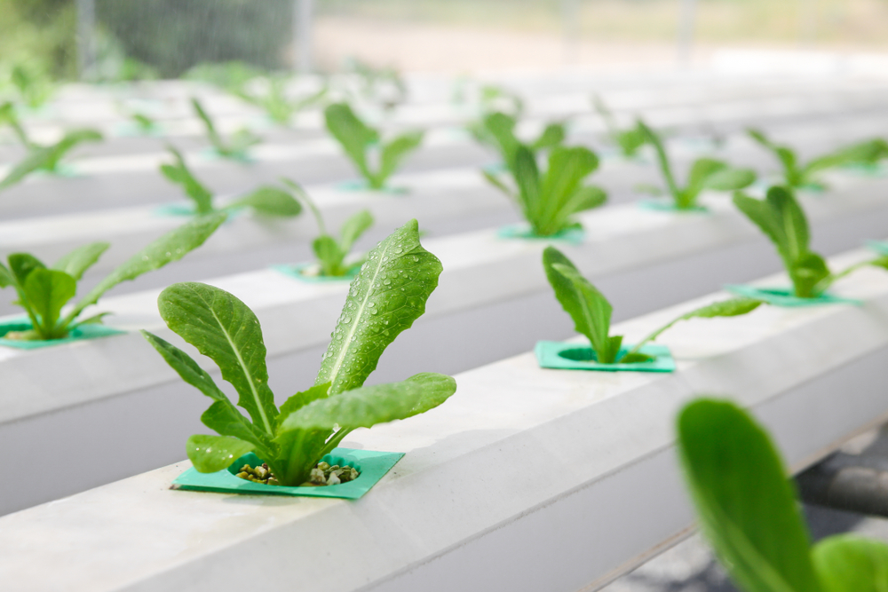
Hydroponics: how to grow lettuce hydroponically (guide, methods, nutrients & tips)
Hydroponics: how to grow lettuce hydroponically (guide, methods, nutrients & tips) Hydroponics grows plants in a nutrient solution rather than soil or …
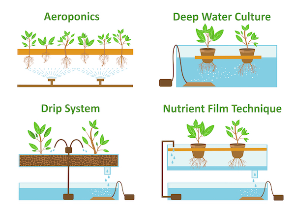
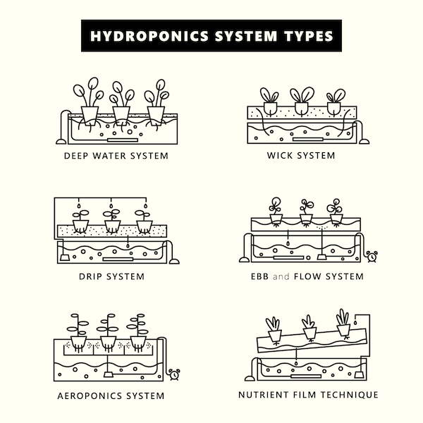
Types of hydroponics systems: advantages and cons of each system (Buying guide)
There are many types of hydroponics systems that can be used to grow plants. The most common type is the ebb and flow system, consisting of a reservoir, an …
[Read more...] about Types of hydroponics systems: advantages and cons of each system (Buying guide)
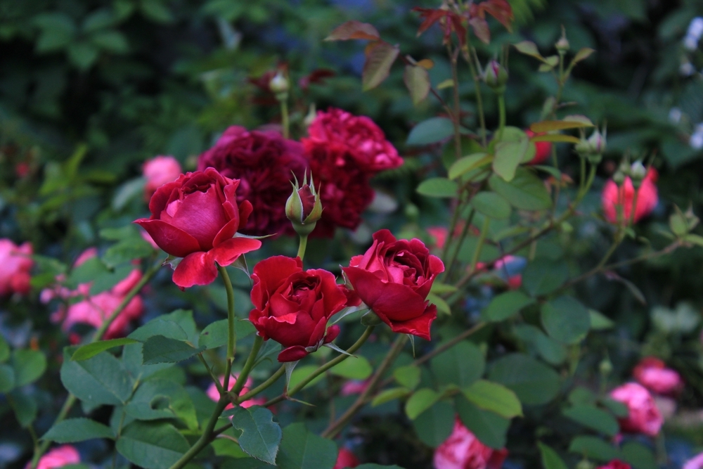
How to Care for Roses: The Best Tips to Grow (pruning, propagating, soil and fertilization)
Roses are one of the most popular flowers in the world and for good reason! I love them! They are beautiful and come in a variety of colors. Roses can be grown …

How to plant bulbs + how to store them (step by step guide)
How to plant bulbs + how to store them (step by step guide) How to Plant Bulbs and Store Them Have you ever seen a garden where all the plants are in the same …
[Read more...] about How to plant bulbs + how to store them (step by step guide)
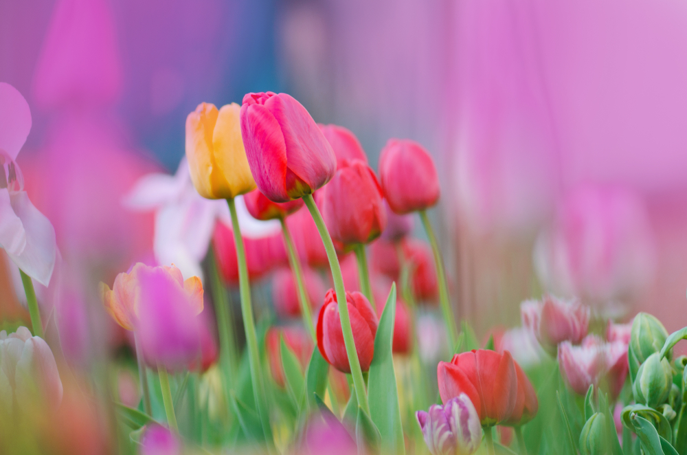
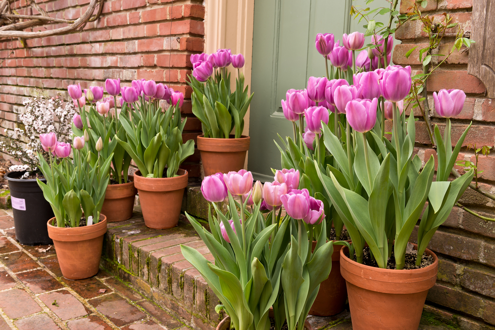
The Ultimate Guide to Tulips: Everything You Need to Know About Planting, Growing, and Caring for Tulips
Tulips are one of the most popular flowers in the world. They come in a wide variety of colors, shapes, and sizes, making them a favorite for gardeners and …
The best spring bulbs: 25 most popular spring bulbs
The best spring bulbs: 25 most popular spring bulbs Bulbs are a popular choice for planting in the springtime because they will bloom into beautiful flowers …
[Read more...] about The best spring bulbs: 25 most popular spring bulbs
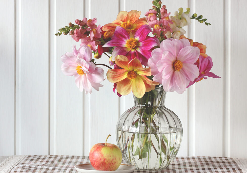
Best cut flowers on a flower farm (most profitable flowers)
There are a lot of different flowers that you can grow on a flower farm, but not all of them will be equally profitable. In this blog post, we will discuss the …
[Read more...] about Best cut flowers on a flower farm (most profitable flowers)
Hydroponics: which vegetables and herbs can you grow hydroponically?
Hydroponics: which vegetables can you grow hydroponically? Hydroponics is a technique for growing plants without soil. You can grow any vegetable …
[Read more...] about Hydroponics: which vegetables and herbs can you grow hydroponically?
16 Types of Plants That Can Survive a Drought
If you're looking for a way to add some color and life to your garden, but don't want to worry about watering it every day, consider adding one of these …
[Read more...] about 16 Types of Plants That Can Survive a Drought
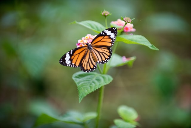
These Flowers Attract Butterflies
These Flowers Attract Butterflies Flowers that attract butterflies to the garden: Environmental stress and other outside influences are not only a problem for …
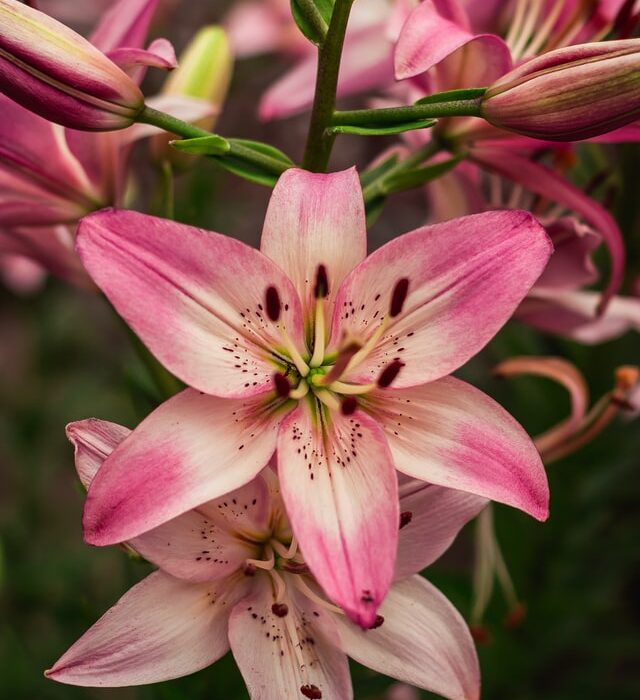
Lily Care Guide: pruning, fertilizer, pests, watering and more!
Lilies (Lilium) are beautiful flowers that can be found in many gardens and homes. They are popular for their delicate petals and sweet fragrance. If you have a …
[Read more...] about Lily Care Guide: pruning, fertilizer, pests, watering and more!
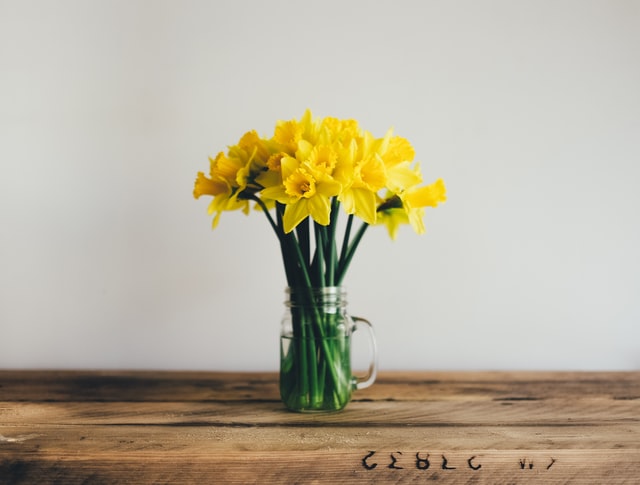
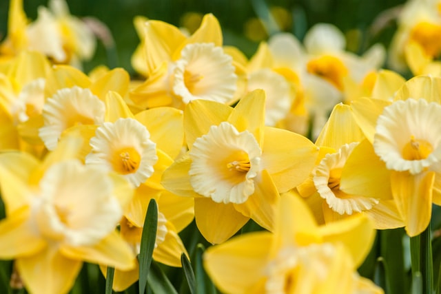
How to Grow Narcissus or Daffodils: Sun, Soil, and Water Needs
Narcissus or daffodils are one of the easiest flowers to grow. They can be grown in most types of soil, as long as it is well-drained. These plants need full …
[Read more...] about How to Grow Narcissus or Daffodils: Sun, Soil, and Water Needs
Winter sowing guide: quick-start seeds
A Winter Sowing Guide: Quick- Start Seeds Winter is a great time to start seeds, but it can be daunting to get started if you aren't sure what you need. For …
Best pH for hydroponics and how to keep the pH balance stable
Best pH for hydroponics and how to keep the pH balance stable: pH for hydroponics The ability to grow plants without any soil has allowed for a myriad of …
[Read more...] about Best pH for hydroponics and how to keep the pH balance stable
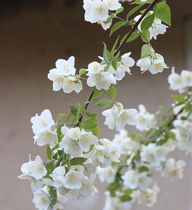
Jasmine: care guide
How to care for jasmine Transplant your jasmine in the spring by preparing the soil. Ensure that you add compost or manure to keep the soil fertile and moist …
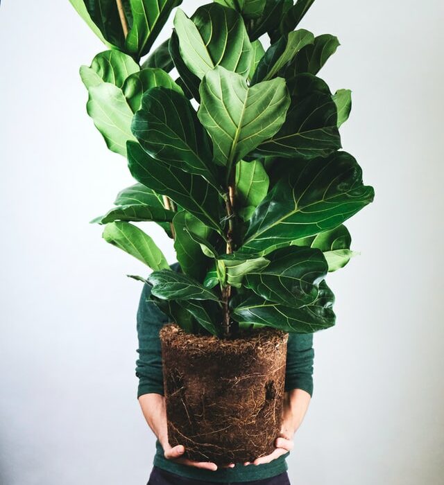
How to Care for a Ficus Plant: The Ultimate Guide
Ficus plants are a popular houseplant because they are so versatile. They can be kept indoors or outdoors, in direct sun or partial shade. There are many …
[Read more...] about How to Care for a Ficus Plant: The Ultimate Guide
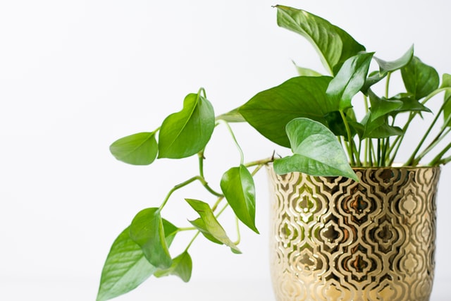
Epipremnum Plants (Pothos): A Comprehensive Guide
Epipremnum aureum, also known as golden pothos or Scindapsus aureum, is one of the most popular houseplants around. It's easy to care for, hardy, and comes back …
[Read more...] about Epipremnum Plants (Pothos): A Comprehensive Guide
Bougainvillea Plants: A Comprehensive Guide: pruning, care, winter care…
Bougainvillea plants are some of the most colorful and vibrant flowers you can find. They can be used as a landscape plant, or even grown indoors in pots. In …
[Read more...] about Bougainvillea Plants: A Comprehensive Guide: pruning, care, winter care…
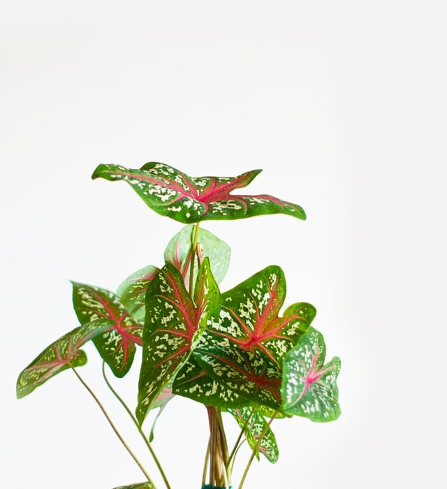
Caladium: How to Plant, Care for, and Enjoy These Hardy Houseplants
If you're looking for a beautiful, versatile, and easy-to-care-for houseplant, look no further than Caladium. These plants are Hardy in zones 9-11 and can be …
[Read more...] about Caladium: How to Plant, Care for, and Enjoy These Hardy Houseplants
Early spring flowers
When the snow starts to melt and the trees begin to bloom, that's how you know it's time to start getting ready to go out into your backyard and enjoy your …
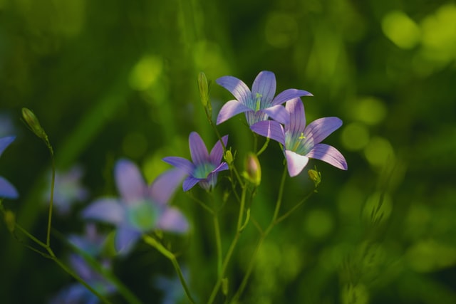
Campanula Bellflower Plants care guide: Everything You Need to Know
Campanula Bellflower plants are a favorite of many gardeners. They are easy to grow, and come back every year. In this blog post, we will discuss everything you …
[Read more...] about Campanula Bellflower Plants care guide: Everything You Need to Know